Friday 26 September 2014

Animatronic antics

So this is what I've been working on recently, a short animation based on the popular horror game "Five Nights at Freddy's."

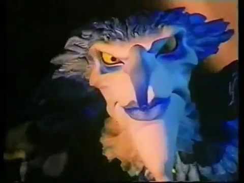
The animation was done entirely in flash over about 3 weeks (it should have taken no more than 2 but September is the birthday month for the Laver household so staying on a computer was no easy feat) and features one of the games enemies, Foxy, dancing to a song from the Lazytown soundtrack (an oddly appropriate one at that).

Here are the three videos I uploaded, revealing a small insight into my process.
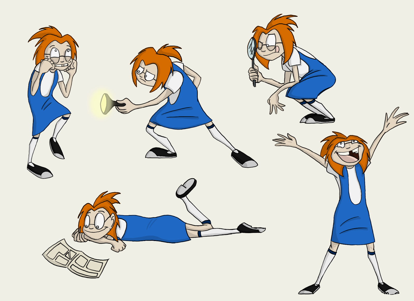
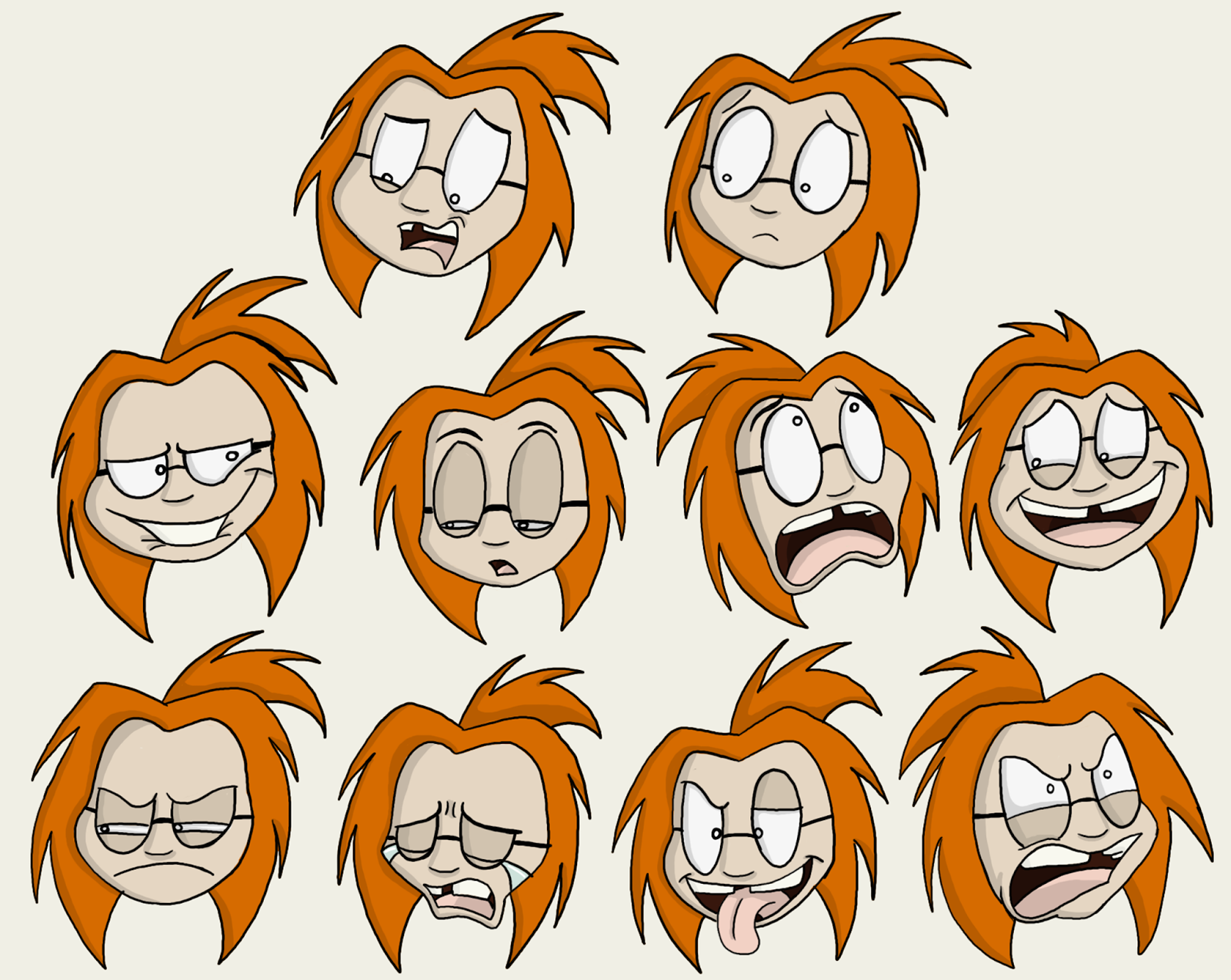
Keyframes


In-betweened rough animation, featuring a planned background 


Final cleanup and colour (now featuring Photoshop-made backgrounds and effects created in After Effects)


This kind of blew up over the internet after it was uploaded (at present it's my most popular animation to date) and I couldn't be more grateful (albeit baffled) about it. I'm incredibly pleased with how it came out, so knowing others are too makes me all warm and fuzzy inside.

Next time you see an animation from me it'll be a collaboration piece with another animator and some amazing voice-actors (featuring this character and his mascot buddies) and then I'll be doing my own original character animation once again. Next update will more than likely be on the art front.

Until then

Sunday 21 September 2014

Spider-man

Or is that man-spider? Well it's a mix of both.

Lucas "Legs" McCowl has a (more or less) finished design after all these years, and now that I've uploaded a full-body picture you can finally see what earned him the nickname "Legs."
Considering he's in a universe where humanoid creatures are commonplace, being an animal with multiple limbs wouldn't be anything particularly special. The namesake came about because Lucas was one of the earlier attempts at mutations and, with the process still being experimental, he and the other earlier subjects had defects. Lucas' being that two of his legs didn't develop properly and just hang out from under his shirt twitching occasionally.

Hope you enjoy him...and his bowling shoes

Next time I'll be posting up my most recent animation

Thursday 18 September 2014

Genie...you're free

This is the drawing I wasn't able to post until recently on other websites; in fact I was unsure about posting it at all when I was able to for fear of opening up wounds for others, but it does need to be spread around.


I drew this genie as part of a huge Robin Williams/Genie tribute piece (made by 90 people) after his tragic passing, the comedian was a huge part of my childhood and he had a huge impact on so many.

I was unsure about spreading this until the actual collab was up (though it has been on DA for about a month), but now that it is I can share it with everybody.

The collab is available here:

http://zimeta.deviantart.com/art/Disney-Club-s-90-Genie-Robin-Williams-Tribute-477190888

and here:

http://zimeta.tumblr.com/post/95405296648/90-genies-robin-williams-collaboration-by-the-good#


Next time we'll focus on something a little happier, more animals.

Monday 15 September 2014

Gator got glasses

A quick update on the art front before I bring up my most recent animated project and more drawings of my ever-growing animal crew (which are evolving every day!) as well as a tribute that has been up for a long time but was kept back because it was kind of exclusive to one site for a long time for reasons I will explain.

Though it's not apparent in my other self-caricatures or any photos people may have seen of me, I do wear glasses. They are solely for distance/glare so I only really wear them when necessary as my vision is not utterly terrible yet (give it time, my job involves staring at a screen all day) but I recently got a pair that were a rather extreme shape, and I've thought of worse reasons for a drawing so:


So now you can see me as a bonkers bespectacled basket-case. Not much, but a little something.

Sunday 31 August 2014

Many thanks!

So those works in progress are now fully fledged drawings. What were they made for you ask? Well after graduation, I wanted to show my appreciation to my lecturers for giving me such fantastic guidance and support these past 3 years; and what better way to thank lecturers of an art course with...well, art.

Each drawing was intended to represent each tutor, either in what/how they taught me or any specific characters that were created within the year they were my lecturer. These images have my signature at the bottom, unlike the originals, which are unsigned but have a personal message on the back and my signature there.

I delayed posting them because I was unsure as to whether all the lecturers actually had them yet (I wanted them to see them first) but I know that Graham got them and is keeping them safe, so it wouldn't hurt to post them now.

 For Graham Griffiths, I drew Gizzard and the Big Bad from my 3rd year film "There be Monsters" as he was my main lecturer during the production of the short.

 For Nicola Marlborough, I drew River Mortis and Charmer, as both characters were created in my 1st year of university for character design/animation, when she was my tutor.


For Brian Fagence and Peter Hodges, my contextual tutors, I drew my gargoyle characters, Liza (left) and Pan (right); both being a double-act. This image was then cut in half and given to each tutor.

And finally Gerald Emanuel, my business tutor, taught us how to be "big fish" in the animation world, so it made sense to draw Bunyip, my little fisherman creature.

My digital painting has certainly improved, as has my anatomy. These were a riot to work on and I hope my tutors enjoy them.


Thursday 3 July 2014

Making progress

So remember those other "important drawings" I said I was working on in the last post? Well here's a quick look at a couple of them.

These are still works in progress, they are in desperate need of colour, but here is some (more or less) finished line art for you all.


Some familiar faces here too, Gizzard and the Big Bad (who really needs a better nickname) as well as Charmer and River, who I haven't properly drawn since my first year of university. She's settled into my updated style of drawing well methinks.

There are 5 of these currently in the works (which I intend to have completely done within the next week) and are being drawn for...reasons I cannot yet reveal (shhh, it's supposed to be a secret).

Night fury

Whether that title is relevant to my state while drawing this or the dragon itself is interchangeable; I did get into a bit of a frenzy while colouring this little fella.

Guess who saw "How to train your Dragon 2" last weekend.

This was an incredible film, incredibly heartwarming and action packed. Great new characters and vast improvements on some of the familiar ones (namely the other dragon riders, who had much more screen-time here. Hiccup, Stoic and Astrid are fantastic too, but I was happy we saw more of Ruffnut, Tuffnut, Fishlegs and Snotlout, because they were hilarious). And yes, the dragons were the highlight of the film, and I still love one dragon in particular.


So here he is, a quick Toothless sketch coloured in Photoshop. With and without the background, because even though the red makes him stand out it is a little distracting.


I did draw a full-body sketch of him too, but that will come a bit later, as I am currently working on some more important art...well, important to me that is.

Now go watch this lovely movie.
Dare I say it's better than the first one? Yes I do! Because I like to live dangerously.

Monday 23 June 2014

"There Be Monsters"-3rd Year Film

So you're probably wondering where I've been these past few weeks, I have been gone for a long time haven't I?
Well it's a long story, there was a lot of action and mystery, there was an epic battle on a train at one point, Liam Neeson had to rescue his daughter AGAIN and I went to the Dagobah system for a while to learn the ways of the force and become a true Jedi...but I'll spare you the details.

The real reason I updated my blog was to announce the online release of this:


Yes, it's finally here, my final film at the University of South Wales. "There Be Monsters."
Follow Audrey and Gizzard as they search for the monsters in her room, and discover whether or not it really is a figment of this little girls imagination.


I'm so pleased to finally get this out in the open and show all of you, this was a real labor of love and it wouldn't have been possible without the dedicated team behind it (my music men, graphics girl and voice actors, who are actually father and daughter in real life!)
A whopping great thank you is also in order for my lecturers, family and friends for supporting me, guiding me and putting up with my...me-ness.


Enjoy! And take care

Until next time.

Friday 9 May 2014

Poster child...or just posters

So while touching up the last few of my backgrounds, meaning a few more shots are completely finished ready for After Effects (my old nemesis!), I created some posters for Audrey's bedroom.

These are incredibly important as they are the primary focus in the establishing shot. I created a set which can be easily transferred for consistency across different shots, which is a huge time-saver as these are rather detailed compared to the basic colouring of the backgrounds.

The whole film is a homage to the horror genre, especially the classic monster movies, which are a favorite of mine, so I had a whale of a time creating these parodies of classics, both in title and the monsters themselves.

The signatures aren't included in the final film obviously!


The hand-written text irks me, and I wish I had time to go back and neaten it; but I can take comfort in the fact that most of the time it will be too small to see and the main focus is on the images.

I don't know about you, but I would totally watch "Kids of the Yeast,"if it was the "children of the corn"/"village of the damned" crossover I made it appear to be.

Monday 5 May 2014

There Be Monsters in colour!

So cleanup and colouring has begun on my final film at long last, with some shots finalized, so I thought it fit to show you a coloured version of a pre-existing shot

So here's Big Bad, snapping and snarling


Thursday 1 May 2014

There be Monsters concept art-The Big Bad

This one is slightly smaller than Audrey's and Gizzards (which I have to apologize for as this fella has a rather major role) but many of his action poses could lead to potential spoilers (as they had him interacting with other characters). So apologies for this, they will be up on this post after the film is up.

But for now let's have a talk about The Big Bad


This lumbering beast (who in reality is nameless) was probably the last monster I designed, solely because his role was so important and he had to leave the biggest impact out of all of the five monsters. As a result, he needed to have the most dynamic construction, colour scheme and overall presence.

Okay, I'll admit, these poses were kind of a joke!

His appearance was originally much more wolf like and mangy, which sadly made him come across as more pathetic than threatening; so his final design is instead based on three creatures in particular; a rat, a bear and a vulture. Considering his primary purpose was to appear frightening, his body consisted of the features of each animals which people often find the most intimidating/squeamish. So for the rat he has the long tail and fingers, for the vulture he has the sharp beak and eyes, and for the bear, it was the general bulk, and even the voice to an extent. This also gave him a wider variety of movements and expressions (for example, the three tufts on the back of his head act like how ears would for many other animals, pinning back when he's angry and fluffing up when he's pleased).


I wanted his colour scheme to stand out compared to the other characters, as while Audrey had a distinct colour scheme that should have made things easy, most of the monsters were already bright, eye-catching colours (blue, purple, green and...then there's Doug who is the color of snot, but that was the point). After experimenting with pretty much every colour on the spectrum, I finalized a pinkish red, as it still connotes how dangerous he is while not being blinding.


This may also be a good time to talk about the voice. While the human characters are voiced by other people, I had a hard time finding people willing to attempt any of the monster voices. So, being an aspiring voice actress when I'm not animating, I had a go myself...at all 5!
Luckily with the magic of pitch shifting, The Big Bad was able to sound animalistic and it's now unrecognizable, while the other 4 came out with enough variety for me to give them a pass without editing.  But we'll see how they sound all together in the final product, then we can all have a good laugh at my expense.


Now next week, we can see more of this guy as we look at my first colour preview from the film.

Wednesday 30 April 2014

There be Monsters concept art-Willard

Now let's take a look at Audrey's father, Willard


Willard's design was finalized shortly after Audrey's, as I wanted them to appear relatively similar. Most of his colours when it comes to hair, skin and even eyes are muted versions of her own colour scheme. His body-shape, clothes and hairstyle on the other hand was heavily influenced by Seymour Krelborn from "Little Shop of Horrors" (which may explain his daughters name).


Of course, both his and Audrey's designs changed alongside the voices provided by their actors (a real-life father and daughter) such as Willard also wearing glasses and having a slightly more narrow face. His original design was much more angular and skeletal, which was incredibly unsettling, so having a voice to help me was a real advantage.


The intention was to have a character who seemed relatively reserved and "boring" to a child, but he was clearly exhausted from trying to keep his daughter under control.
That said, the short is merely a small part of a much larger story, and features such as the grey stripe and Willards seemingly nervous personality in the concept art has much greater significance in the bigger picture; which makes his rather calm attitude while discouraging his daughter a litle more suspicious in the grand sceme of things, but also strong enough as a stand-alone character trait in the short.


It was also while creating Willard that I came up with the idea of naming many of my characters after actors or characters within the horror genre, while also keeping their names canon within the films time period. Willard is named after the titular character of the 1971 film, Audrey, while primarily being named after my grandmother, is also a subtle reference to the "Little Shop of Horrors" character (both human and plant), and the four monsters Nicholas, Doug, Grace and Simon, share their names with the cenobite actors in "Hellraiser."


The only characters who break the trend are Gizzard (who is instead a reference to an organ, which I thought would reflect Audrey's strange personality if she named her pet something disgusting) and the largest monster, who I call "Big Bad," but in reality has no actual name as I felt keeping him nameless would give him a greater sens of mystery and fear.

Speaking of which, we'll take a look at the big bad tomorrow!

See you then!

Monday 28 April 2014

There be Monster concept art-Gizzard

And now a look at the character model pack for the panicky pooch, Gizzard

Dogs are often the go-to animal sidekick for obvious resons. Man's best friend is a pack animal, so they're more inclined to follow and defend their owners (can you tell I'm a dog person?). So when it comes to a fantasy story where the protagonist is thrown into constant danger, it's fun to play around with this concept. On the one hand you have a genuine protector such as Jake the Dog, or you can have him be a coward such as Scooby Doo and Courage.


As for Gizzard, I decided to portray him as a devoted pet who is keeping Audrey out of danger for her own sake rather than his supposed cowardice. You get a sense that he's fully aware of the potential danger his owner keeps searching for, but is more afraid for her safety than the danger itself.


His design is based loosely on a beagle, which was the most common breed of dog owned in the 1950's (the time period which my film is set in). Though he isn't supposed to be any specific breed. I intended to have him share Audrey's scruffy appearance, but to indicate he's often received most of the damage, hence his battered ear and odd pupils (the hollow eye is also lazy, which you will see in the final film).


Gizzard appearance is also supposed to give the impression that there's something...off, about him. His character clearly knows more than he is letting on, and to convey that his characteristics are out of the ordinary, so he isn't perceived as merely a nervous dog. It adds much more tension to the film when you see he clearly knows something Audrey doesn't.


Tomorrow (or later today if the fates allow), we'll take a look at Willard, Audrey's father.

Sunday 27 April 2014

There be monsters concept art-Audrey

So my final film is about 3 weeks away from hand-in; so for your viewing pleasure, I will be posting the expressions, action, and turnaround pages for the 4 main characters (as well as the colour ref pages once again so they are all together).

First up, Audrey McMarro.
Audrey is a 9 year old girl with an obsession for all things frightening; often searching her room for the fabled monsters with her poor dog in tow!


I intended for Audrey's design to differ greatly from most child characters in film and television, to stand out (hence why I made her rather lanky and changed her color scheme to bright, complimenting colours). The primary reason I researched the portrayal of children in animated media for my dissertation was to benefit this, and I am incredibly satisfied with the final result.


I wanted her to look like a child who grew up in a town where she was expected to be a little lady, but is constantly exploring places she shouldn't, hence her rather messy hair and missing teeth. She's rather scrappy. Plus all those late nights staying up monster hunting has put a terrible strain on her eyes!


One of her biggest inspirations personality-wise was Finn the Human from "Adventure Time" (who also has a dog-sidekick oddly enough), because he's the prime example of a character who is out of the ordinary and "weird", but is still sociable, active, and has a sense for danger. I didn't want Audrey to fall into the stereotypes of the geek or the tomboy, when children can quite easily be both.


 Tomorrow we'll get a look at her animal accomplice, Gizzard

Friday 18 April 2014

Gator takes a look at...Sandman Animation and Kieron Seamons


So we’ve been darting back and forth from the US and the UK on this studio exploration, so how about we end the trip somewhere completely different…China!

So let’s take a look at

Sandman Animations


GAH! NOT YOU!


THESE! Sandman Animations


CLICK HERE TO GO TO THEIR WEBSITE!

Apologies in advance for the lack of images this time around, as much of the websites content does not show up on my blog. Of course all of their content is viewable from the link above.

Founded in 2006, Sandman Animations is actually the most recent company in my list, and is also one of the most impressive animation studios in Asia; specialising in 2D animation as well as CG.
At its helm is Kieron Seamons, the animation director, who you may recognise for his work on “Who Framed Roger Rabbit,” “Balto” and “An American Tale 2 (among many other projects). The man is incredibly talented, with an incredibly diverse portfolio and it really shows with the work Sandman creates.


The studio has created series including “My Pet,” “Ra Ra,” “Little China” and has even worked on “Horrid Henry,” probably the most recognizable to my western readers.

Here's an example of their work:


And here's some of Kieron's work


As you can see, the studio has a great deal of skill behind all of its work, and understandably so; as the company strives to ensure that its 120+ employees are the best of the best. In fact, the Sandman Animations classes have been created to enhance the quality of animation all across China.
That’s the main reason why I admire this company so much, it strives to build on others pre-existing skills, and help them to improve to an even higher standard. Talented animators helping other talented animators, and everybody benefits as a result, and the animation industry in China becomes greater than before. They are determined to improve the market and that dedication and support is a wonderful quality to have.


They have even set up a DIP Studio to cope with the high demand, and are always adapting and evolving with the growing industry, another important trait in any successful animator.
Combine that with wonderful worlds, diverse, vibrant characters and raw talent; and it’s no surprise Sandman has done so well.


Good job everyone

Be sure to follow the link below to go to the studios youtube page, where you can see more of their work as well as Kieron's.


(I also want to leave a heartfelt thank you to Kieron Seamons, who took the time out of his day to answer a few of my animation questions a few months ago, and even browsing my blog to give me feedback on my work. It meant a great deal to me to have somebody respond to my email, especially from somebody I respect so much, and it further illustrates his studios support for new talent.)


And so with that, our animation exploration comes to an end. It’s been a blast, and I loved speaking about these studios.

Next time, we’ll be coming back to my own work, and I’ll give you another sneak peek into the artwork behind “There Be Monsters.”

Thursday 17 April 2014

Gator takes a look at...Cartoon Network Studios


Now let’s see a studio that has not only been around for several years, but came into being to provide content for one primary channel.
 
Cartoon Network Studios

 File:Cartoon Network Studios 5th logo.png

Founded in 1994, the studio was a division of Hanna-Barbera cartoons (also known as the people who created the "Flinstones," "Scooby Doo" and "Tom and Jerry") as well as a subsidiary of the Turner Broadcasting System (which now owns many popular American channels, including Adult Swim and CNN). 

Until 1997, the studio remained merged with Hanna-Barbera, before becoming a separate entity. The studio created such unique animations as “The Powerpuff Girls,” “Dexter’s Laboratory,” “Cow and Chicken” and “I am Weasel.” 


While much of their work created under the Hanna-Barbera name can be found on Boomerang, Cartoon Network is the main home for many of the studios productions (hence the name). 
Now free to create many different style of animation, breaking away from the limited animation Hanna-Barbera is known for, we were given (deep breath now, this is a long list).

“The Grim adventures of Billy and Mandy,” “Evil con Carne,” “Star Wars: The Clone Wars,” “Fosters Home for Imaginary Friends,” “Camp Lazlo,” “Ben 10,” “Samurai Jack,” “Adventure Time,” “Regular Show” and “Steven Universe.” And that’s not even all of them!


I need a lie down.

So as you can see, the studio has clearly earned its stripes by creating such a large amount of content. But does quantity necessarily equal quality in this case? Well…yes…I mean, it’s on my list of top 5 influential companies, that…that was a silly question.

http://www.picgifs.com/clip-art/cartoons/dexters-laboratory/clip-art-dexters-laboratory-066458.jpg

But yes, many of these shows are wonderfully done, and have a great deal of variety when it comes to story and target audience. “Ben 10” being more for the younger side, while “Regular Show” boasts a more mature feel. 


Well, mature in humour and style anyway.

The animations are incredibly versatile to boot; with “Fosters” and “Samurai Jack” boasting a cut-out, hand-crafted appearance, with Jack portraying it in a darker light while Fosters is more childish and bright; while “Camp Lazlo” and “Grim adventures” are a little more polished, with bold lines and buggy-eyed characters. 


But the main thing I love about this company is its dark, twisted approach to everything it does.  The character designs are incredibly caricatured and over the top, the worlds are bizarre and the humour can be especially grim. Everything has a rather…rough appearance. There are no pretty girls or muscle men (excluding Johnny Bravo!), it’s mostly children or strange creatures.


This company is the anti Cosgrove Hall to me; while the UK company gives its characters a sense of believability and realism, Cartoon Network strives to have its characters defy every law of logic they can. But of course, in order to keep us watching and to stop the characters from being random for the sake of random, they establish incredibly detailed worlds and scenarios which make them acceptable. The tone is light-hearted and fun, so the creepier moments and mature elements are a welcome surprise, whereas with Cosgrove, the tone is often darker and more sombre, so it makes sense to have the characters have a more realistic aura.


When you’re in a world where you know a vampire queen and an ice king are hanging out in a house practising music, while a human boy and a shape-shifting dog are outside, it’s a welcome pause from the madness to explore the more emotional side of the characters. We get a sense of how they are relatable, and that prevents them from losing the audience by being too farfetched. I believe Cartoon Network has mastered that balance.


I have to say, this company is the one which speaks to me the most regarding its style. Sticking to mostly 2D animation, which perfectly utilizes their limitless characters, and expands the possibilities of insanity they can achieve. Add frightening imagery and a crazy imagination and you have yourself one heck of a studio.


So, for the final entry, we’ll be travelling somewhere new and stopping off at a studio whose name sounds…oddly familiar.